| A theme represents elements of a design |
|---|
| a banner, a background, icons, buttons, fonts - all united into one artistic conception. |
Choosing a theme
Some themes are currently bundled with the installer package. You can install them all and later set which one you want to use.

Note: At some point in the future, themes will no longer be included in the installer and instead Clover will be shipped with a single embedded theme (which it already has).
You can now get themes from the new Clover Theme Repository by either downloading them manually using the Terminal. or DownGit
Creating a theme
File Types
Clover's GUI can load and use .png and .icns formats.
Traditionally, the OS device icons (for example, os_cougar.icns), used Apple's ICNS format which encapsulates multiple image sizes in one file. When using .ICNS files with Clover, two image sizes are made use of: 128x128 and 32x32 pixels. Click the following link to the os_cougar.icns file from the BGM theme for an example: os_cougar.icns
However, Clover's .ICNS decoding only supports icon types which were introduced in OS X 10.0. OS X 10.7 introduced extra icon types which are currently not supported. For example, you can see in the following wiki link that a 128x128 pixel image created from OS X 10.7 and newer can use an OSType of ic07. This is not supported because even though Clover can read and decode the embedded .PNG file itself, it is not aware of the new type(s) to extract the data from within the ICNS file. http://en.wikipedia.org/wiki/Apple_Icon_Image_format
To help this situation, as of Clover r2231, the GUI can now also use .PNG images to represent the OS device icons. Clover can scale the .PNG images, if necessary, depending on the user/designers choice of the Badges->Swap option in the theme.plist.
Please note: Clover still expects to find an OS device icon with a .icns file extension. So even though the image may be a .png it still needs to have a .icns extension.
File Sizes
A complete Clover theme can contain many images which if not controlled can result in a theme directory being many megabytes is size. This has had a direct impact on Clovers' packaged installer which has grown considerably over the last year. As a result the themes that are in the packaged installer are being optimised so the files can be as small as possible whilst retaining the original design.
It's the responsibility of the designer to keep their images optimised and to also make sure they remove any unwanted excess. To help you do that, please read this insanleymac forum topic which is a basic overview of an original post from projectosx which is no longer available.
theme.plist
The theme settings are defined in theme.plist, which resides in the theme directory and is unique for each theme. For instance the path to the metal theme is /EFI/CLOVER/themes/metal/theme.plist.
Opening the existing theme.plist in a plist editor (recommended) or a text editor will show the xml structure which is described as follows.
Description
<key>Author</key>
<string>Slice</string>
<key>Year</key>
<string>2012</string>
<key>Description</key>
<string>Main metallic looking theme</string>
<key>Theme</key>
<dict>
Origination
Let Clover know the screen resolution that the theme was originally design at. This is so animation positions can be recalculated when using the theme at a different resolution. * Note, this is currently only used when using the newer positioning settings in the Anime array (see below).
<key>Origination</key>
<dict>
    <key>DesignWidth</key>
    <integer>1920</integer>
    <key>DesignHeight</key>
    <integer>1080</integer>
</dict>
Background
<key>Background</key>
<dict>
    <key>Path</key>
    <string>MetalBack.png</string>
    <key>Type</key>
    <string>Crop</string>
    <key>Sharp</key>
    <string>0x80</string>
    <key>Dark</key>
    <true/>
</dict>
Path- Name (or path) of the background imageTypeCrop- Cut a big image to fit the monitor size or fill the remaining space with a solid colour without rescaling.Tile- Tile the image to fill the area.Scale- Stretch the image to occupy the whole screen, with cutting.
Increasing the image size produces square pixels, which can be minimised with smoothing. However, smoothing distorts the edges. Clover will detect them and the following parameter allows fine-tuning:
-
Sharp- Minimal value
0x0- no detection, smooth edges. - Maximal value
0xFF(255) - Full detection, no smoothing.
- Minimal value
-
Dark<true/>- Dark image with bright lines.<false/>- Bright image with dark lines.
The image format is PNG, optimally with a correct header. The "Preview" app for example saves them in a correct format.
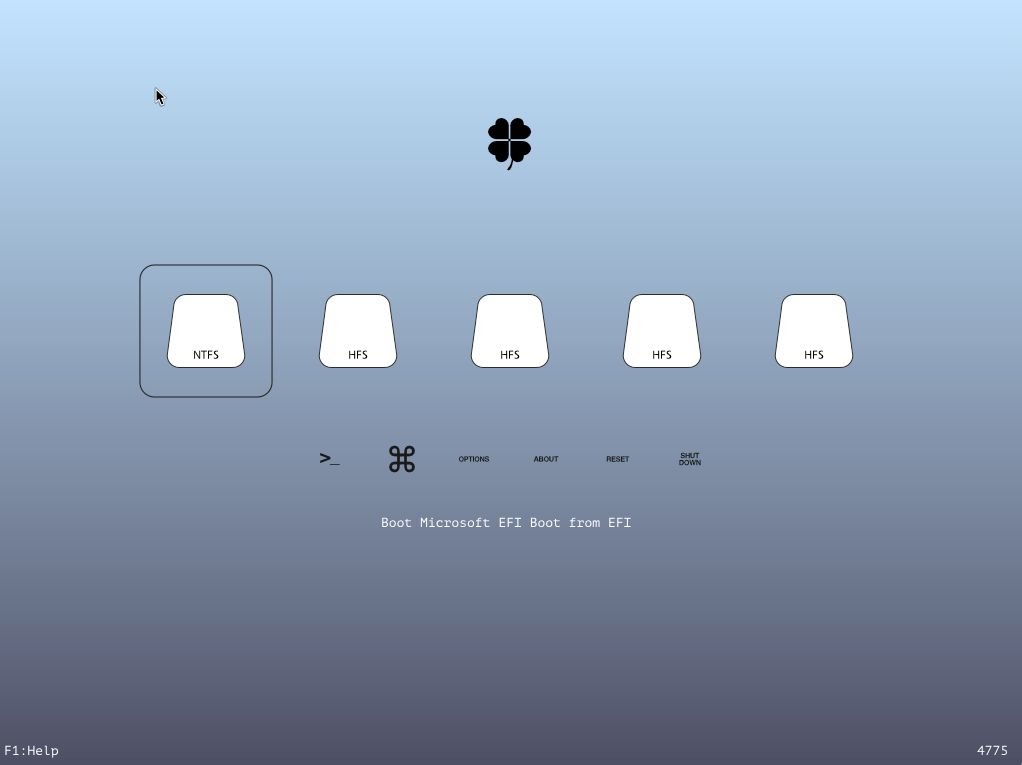
Badges
Badges are small icons in the lower right corner of a loader entry. The initial design was to show disk in the main icon (like Boot Camp) and the operating system in the badge.
<key>Badges</key>
<dict>
    <key>Show</key>
    <true/>
    <key>Inline</key>
    <true/>
    <key>Swap</key>
    <false/>
    <key>OffsetX</key>
    <integer>nn</integer>
    <key>OffsetY</key>
    <integer>nn</integer>
    <key>Scale</key>
    <integer>nn</integer>
</dict>
Show- Show badges or notInline- Move badge to the information line of a chosen loader.Swapis ignored in this case. Take iClover theme as a reference.Swap- Swap the meaning of icons and badges. Icons will show the OS, badges the device type (not interesting to display them in this case).Scale- Sets the badge's scale to n/16 of original size. Examples (based on original image being 128x128px). A value of 5 results in scaling to 40x40px, 8 scales to 64x64px, 16 doesn't scale so leave at 128x128px.OffsetX- Sets the badge's horizontal position inside the main menu item.OffsetY- Sets the badge's vertical position inside the main menu item.
OffsetX and OffsetY set the number of pixels across and down from the top left corner of the OS device selection area and indicate where to draw the badge icon. Valid lowest value is 0, and the max valid value is calculated by subtracting the badge width (64px) from the with of the OS device selection area (Selection Big). If either value is larger than the result then the default position of the result is automatically set and the boot log will contain an entry similar to ‘User offset X nn is out of range’.
Banner
The banner is a centred image with limited dimensions depending on the monitor size. For instance, theme dawn has a banner with a dimension of 672x190px, which should be considered as a limit. If you do not use a background drawing, the banner should be opaque and its first pixel will determine the background colour. Otherwise you may use a trick and set transparency of the first pixel to 1%.
<key>Banner</key>
<string>logo-trans.png</string>
UPDATE: Since rev2524 (and with better placement with rev2534) the Banner can now optionally use new positional settings as used for the animations.
<key>Banner</key>
    <dict>
        <key>Path</key>
        <string>logo_trans.png</string>
        <key>ScreenEdgeX</key>
        <string>left</string>
        <key>DistanceFromScreenEdgeX%</key>
        <integer>nn</integer>
        <key>ScreenEdgeY</key>
        <string>top</string>
        <key>DistanceFromScreenEdgeY%</key>
        <integer>nn</integer>
        <key>NudgeX</key>
        <integer>nn</integer>
        <key>NudgeY</key>
        <integer>nn</integer>
    </dict>
See the Anime section for an explanation of these settings.
Components
Components are groups of UI elements, you may specify which groups your theme uses.
<key>Components</key>
<dict>
  <key>Banner</key>
  <true/>
  <key>Functions</key>
  <true/>
  <key>Tools</key>
  <true/>
  <key>Label</key>
  <true/>
  <key>Revision</key>
  <true/>
  <key>MenuTitle</key>
  <true/>
  <key>MenuTitleImage</key>
  <true/>
</dict>
Banner- Show or hide the banner image.Functions- Show or hide the system functions such as About, Restart, and Shutdown.Tools- Show or hide the system tools such as Shell.Label- Show or hide the entry description label.Revision- Show or hide the Clover GUI revision version.MenuTitle- Show or hide the menu title on the help, about and options screens.MenuTitleImage- Show or hide the menu icons that are drawn beside the menu text on the help, about and options screens.
Selection
<key>Selection</key>
<dict>
    <key>Color</key>
    <string>0xF3F3F380</string>
    <key>Small</key>
    <string>Select_trans_small.png</string>
    <key>Big</key>
    <string>Select_trans_big.png</string>
    <key>OnTop</key>
    <true/>
    <key>ChangeNonSelectedGrey</key>
    <true/>
</dict>
Color- Row selection colour in menus, optimally matching the overall theme colours. Example0x11223380: red=0x11, green=0x22, blue=0x33, alpha=0x80. The transparency (alpha) value of 0x80 is 50%. 0x00 means a fully transparent selection, 0xFF means a solid colour.Small- Selection image for small option icons in the lower GUI row.Big- Selection image for big OS icons in the upper GUI row.OnTop- If true, the selection image will be drawn over the main image.ChangeNonSelectedGrey- Draw all non selected device icons and their associated badges as greyscale.
Note: The Selection Big image is to be sized at 144x144 pixels when using 128x128 pixel device icons, or 288x288 pixels when using 256x256 pixel device icons. The Selection Small image is to be sized at 64x64 pixels. Note2: Clover r2707 or newer is required for full support of positioning device icons sized 256x256 pixels.
Layout
Change the vertical position of some of the GUI's elements.
<key>Layout</key>
<dict>
    <key>BannerOffset</key>
    <integer>nn</integer>
    <key>ButtonOffset</key>
    <integer>nn</integer>
    <key>MainEntriesSize</key>
    <integer>nn</integer>
    <key>TextOffset</key>
    <integer>nn</integer>
    <key>TileXSpace</key>
    <integer>nn</integer>
    <key>TileYSpace</key>
    <integer>nn</integer>
    <key>Vertical</key>
    <true/>
</dict>
BannerOffset- Increase the space (pixels) under the banner. Effectively pushing the OS icons down on the main screen.ButtonOffset- Move the vertical position (pixels) of the tool buttons.MainEntriesSize- The size of the main device icons is set internally in the code to 128. Changing this value will instruct Clover to scale the device icons. For example, using a value of 256 on a theme with 128px icons will show the device icons scaled up to 256px. Note: badges will not be affected and will more than likely need repositioning.TextOffset- Move the vertical position (pixels) of the Main menu text; the one that reads 'Boot Mac OS X from xxxx'.TileXSpace- The spacing between the Selection Big area of each main device icon. Internally, this defaults to 8. So if using 128x128 pixel icons with a 144x144 pixel selection big, the next device icon's selection big area will be drawn 144 + 8 pixels to the right of the previous one.TileYSpace- The spacing between the Selection Big area of the main device icons and the Selection Small area of the smaller tool buttons. Internally, this defaults to 24. Note, the ButtonOffset setting also affects this position (needs to be verified).Vertical- Displays the OS Icons vertically down the right edge of the screen. Set either true or false. (Introduced in rev2535).
Note experiment moving these by small amounts (ie. 10's pixels and not 100's pixels because when viewed at a smaller resolution this could be drawn off screen).
Font
<key>Font</key>
<dict>
    <key>Type</key>
    <string>Load</string>
    <key>Path</key>
    <string>BoG_LucidaConsole_10W_NA.png</string>
    <key>CharWidth</key>
    <integer>10</integer>
</dict>
-
Type- Font type
Alfa- built-in fontGray- built-in fontLoad- Load external font
-
Path- External font path, e.g.
BoG_LucidaConsole_10W_NA.png
- Following conventions exist for the file name (blackosx):
- BoG - Black on Gray
- LucidaConsole - original font name
- 10W - font width
- NA - No Antialiasing
- Following conventions exist for the file name (blackosx):
-
CharWidth- Character width, default is 16
One way to create fonts is by using a bash script together with Imagemagick. See this thread at insanelymac
Scroll
The settings menu can be bigger than the actual vertical size of the monitor and in this case scroll bars will appear.
<key>Scroll</key>
<dict>
    <key>Width</key>
    <integer>N</integer>
    <key>Height</key>
    <integer>N</integer>
    <key>BarHeight</key>
    <integer>N</integer>
    <key>ScrollHeight</key>
    <integer>N</integer>
</dict>
Width-Height-BarHeight-ScrollHeight-
Anime
A theme may contain animated images in PNG format.
<key>Anime</key>
<array>
    <dict>
        <key>ID</key>
        <integer>1</integer>
        <key>Path</key>
        <string>logo_3D</string>
        <key>Frames</key>
        <integer>15</integer>
        <key>FrameTime</key>
        <integer>200</integer>
        <key>Once</key>
        <false/>
        <key>ScreenEdgeX</key>
        <string>left</string>
        <key>DistanceFromScreenEdgeX%</key>
        <integer>nn</integer>
        <key>ScreenEdgeY</key>
        <string>top</string>
        <key>DistanceFromScreenEdgeY%</key>
        <integer>nn</integer>
        <key>NudgeX</key>
        <integer>nn</integer>
        <key>NudgeY</key>
        <integer>nn</integer>
    </dict>
</array>
ID
- Determines the animation type and placement
1- Logo2- About3- Help4- Options5- Graphics6- CPU7- Binaries8- DSDT9- BOOT Sequence10- SMBIOS11- Tables Dropping12- RC Scripts Variables13- PCI Devices14- Themes21- Apple22- WinXP23- Clover24- Linux25- BootX64.efi26- Vista30- Recovery34- Tiger35- Leopard36- Snow Leopard37- Lion38- Mountain Lion39- Lynx
Path
- Animation name. Points to a folder containing the animation sequence. It is possible to omit frames to create a pause while the last working frame is being used:
-
ML_Anim_000.png
-
ML_Anim_001.png
-
ML_Anim_008.png
-
ML_Anim_014.png
-
Frames- Total frame amount. Missing frames will be replaced using above method. -
FrameTime- Time between each single frame in milliseconds.
Once
- Loop setting
-
<true/>- Animation is played once until the menu is quit with the Esc key or pressing the right mouse button. -
<false/>- Animation is looped endlessly without any pause between the last and first frame. -
ScreenEdgeX- the edge of the screen to use for the calculation. Options are left or right. -
DistanceFromScreenEdgeX%- % away from left or right of the screen edge to place the animation. Value is as an integer. -
ScreenEdgeY- the edge of the screen to use for the calculation. Options are top or bottom. -
DistanceFromScreenEdgeY%- % away from top or bottom of the screen edge to place the animation. Value is as an integer. -
NudgeX- Fine tune the horizontal position by a range of +-32 pixels. -
NudgeY- Fine tune the vertical position by a range of +-32 pixels.
ScreenHight
New feature for theme designers. Automatic choose "yourtheme" or "yourtheme@2x" if monitor is 2k or larger.
The criteria is ScreenHight > 1100.
For example, if you choose theme=metal then you will use theme from folder "metal" on monitor 1920x1080 and a theme from folder "metal@2x" on monitor 2048x1560.
Vector Themes
Rev 4844
Vector Themes ⇩
Here I want to introduce support for Scalable Vector Graphics for Clover GUI will not depend on screen resolution.
Dedicated topic ➤ Clover Vector Themes
We will can draw all interface elements in SVG and scale theme to screen resolution. To do that I found very tiny and simple project nanosvg which is written in C and open source. Nonetheless including it into Clover has obvious problems:
- we have no float mathematica; (OK, I made it)
- we have no standard
sscanf(), we just have feeble StrDecimalToUintn()function, etc.; - we have no some other standard functions (malloc, realloc, free, qsort); and non-obvious problem: I don't know how many logical mistakes in the project. I will work on these problems and invite all coders to help me. Next steps will be learn Clover how to load SVG graphics and render it. Then scalable GUI layout. Then scalable fonts. AFAIK there can be SVG fonts. Moreover SVG can be animated. Meanwhile designers may started to draw vector themes. Welcome to new era!
Rev 4752
Multilevel dithering. By default level = 1.
level = 0 will be without dithering.
For radial gradients like on Clovy vector theme this is not enough. A distance between different colors is too big. So we need dithering with larger steps. I can't calculate the step automatically, so I introduce addition for SVG "ditherCoarse". It must have a namespace Clover to be ignored by other applications.
<radialGradient id="GrayRadialBackground_1_" cx="358.2806" cy="0.743" r="0.8783"
                    gradientTransform="matrix(4.700000e-14 768 -768 4.700000e-14 1176.1536 -274946.875)"
                    gradientUnits="userSpaceOnUse"
                    clover:ditherCoarse="16">
		<stop  offset="0" style="stop-color:#606060"/>
		<stop  offset="1" style="stop-color:#1F1F1F"/>
	</radialGradient>
Rev 4779
Implemented bootcamp style for vector themes It looks like this:
In <clover:theme...settings there will be:
BootCampStyle="1"
And there must be indicator image. I draw simple triangle.
<g id="selection_indicator">
	  <rect visibility="hidden" id="BoundingRect_141_" x="83" y="15" class="st162" width="64" height="64"/>
    	<path d="M 490.376 309.525 Q 490.992 308.43 491.641 309.525 L 507.876 336.934 Q 508.525 338.029 507.26 338.029 L 475.613 338.029 Q 474.348 338.029 474.964 336.934 Z" style="fill: rgb(216, 216, 216);" />
</g>
Rev 4789
Three big news with SVG support:
- Image can contain text

- Vector theme can have animated main screen, Day/Night

Clover EFI Bootloader
Developers:
- Slice, with help of Kabyl, usr-sse2, jadran, Blackosx, dmazar, STLVNUB, pcj, apianti, JrCs, pene, FrodoKenny, skoczy, ycr.ru, Oscar09, xsmile, SoThOr, rehabman, Download-Fritz, nms42, Sherlocks, Zenit432, cecekpawon, stinga11, TheRacerMaster, solstice, Micky1979, Needy, joevt, ErmaC, vit9696, ath, savvas, syscl, goodwin_c, clovy, jief_machak, chris1111, vector_sigma, LAbyOne, Florin9doi.
Source code credits to:
Intel, Apple, Oracle, Chameleon, rEFIt and Xom, nanosvg.
Packages credits to :
Chameleon team, crazybirdy, JrCs, chris1111.
Clover is open source based on different projects :
- Clover, rEFIt, XNU, VirtualBox. The main is EDK2 latest revision
- Recent developments and changes in details at Clover Change Explanations
- Support forum discussion AppleLife (Russian) Insanelymac (English) macos86.it (Italian)